UX Mapping
Defined the main user journeys, screen structure, and app navigation flow.
01A mobile-first product experience designed for clean navigation, fast user actions, and scalable app growth.
case-study-preview.tsx
LIVE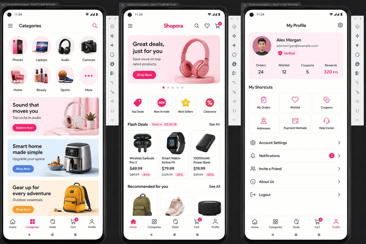
The goal was to create a mobile interface that feels polished without becoming complicated. Every screen was planned around clear hierarchy, readable content, fast actions, and a structure that can grow as new features are added.
Defined the main user journeys, screen structure, and app navigation flow.
01Created a clean mobile UI with strong spacing, readable cards, and focused actions.
02Built reusable components, API-ready sections, and responsive app layouts.
03Tested user flow, button states, mobile scaling, and interaction consistency.
04The solution focused on a compact interface system that keeps the app simple while leaving room for future features.
Every layout was designed for smaller screens first, then scaled for larger devices.
Cards, buttons, status blocks, and sections were structured for repeatable use.
The user flow was simplified so important actions are easy to find.
The app structure supports future modules without needing a full rebuild.
“The mobile app structure was clean, professional, and easy to understand. It felt like a real product from the first version.”
— Alex, Mobile Startup Founder
Ready to turn your mobile idea into a clean product experience?
Start a Project →